Voyage
2023Improve booking an airline flight for desktop
UX Research & Design Diploma Course Project 2023
Background
For this assignment, I developed a clickable prototype for a new digital product, which incorporated a number of workflows. I decided to look at the userability of booking a flight via an airline website.
Goals
Creating a clickable prototype to help effortlessly book a long haul flight.
Problem
To practice going through a design process step by step and learn how to use design & prototyping software.
To be able to draw a line from customer insight to designed product and to create a high-quality piece of interaction design.
Research
Goals
The goals of this project are as follows:
To practice going through a design process step by step.
To be able to draw a line from customer insight to designed product.
To create a high-quality piece of interaction design.
To get a better understanding of prototyping software.
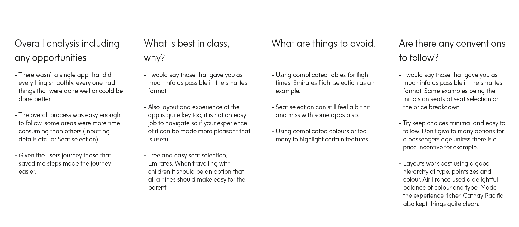
I discovered that those that gave you as much info as possible in the smartest format where the easiest to navigate. Some examples being the initials on seats at seat selection or the price breakdown. My findings were summarised in a simple document seen here.
Methodologies
I used multiple data sources to work out the best solutions to any pain points that might arise.
I drew my insights from testing these personas and producing a Customer journey map along with identifying patterns.
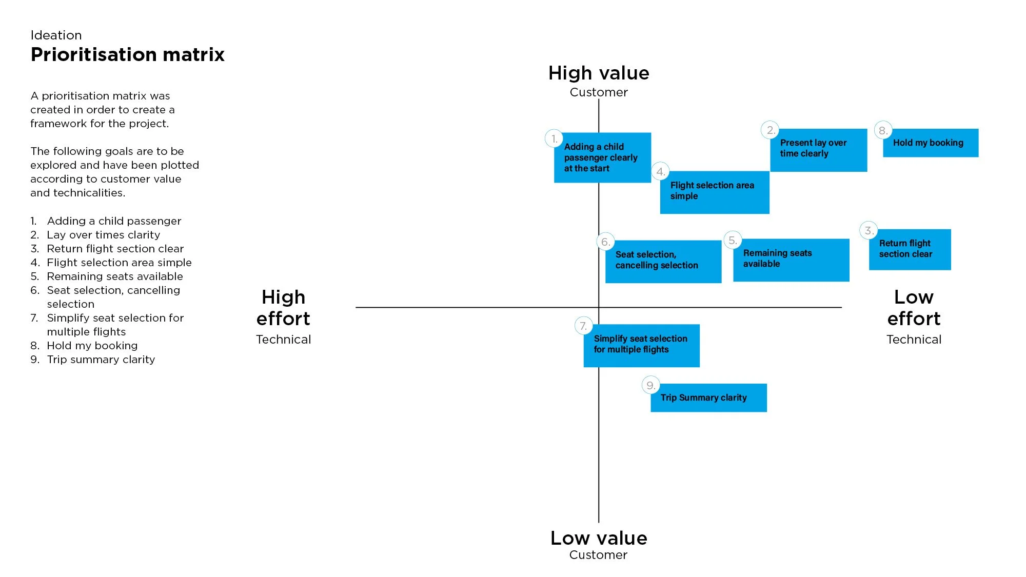
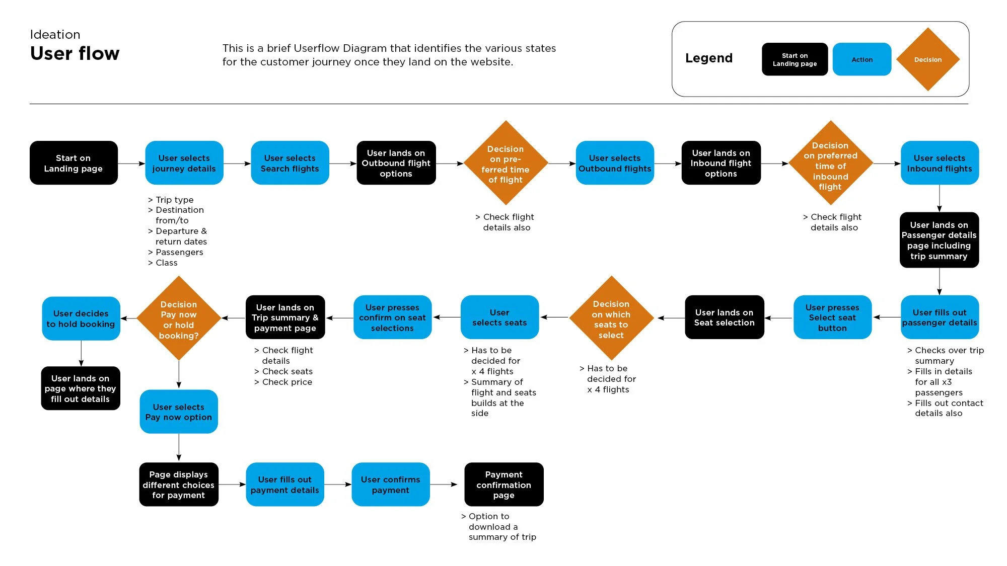
Then by identifying my findings using How Might We diagrams a Prioritisation matrix and a Userflow diagram I gathered the information I needed to find suitable solutions for goals and pain points to develop through my prototype.
Competitive Research
I started with competitive benchmarking, taking four well known, long haul airline company websites and assessing their user ability. My goals were to learn how best-in-class websites and apps solve problems.
To gain a better understanding of UX and UI conventions and to highlight best practice that could be emulated.
I discovered that here wasn’t a single app that did everything smoothly, every one had things that were done well or could be done better.
Customer Journey
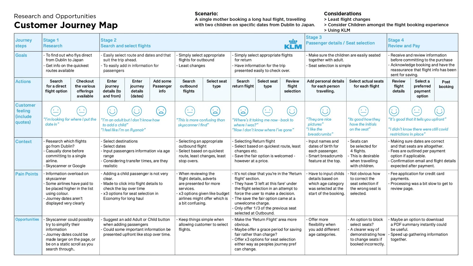
Taking the Persona into further consideration I then did further research using 4 people who fell into the same category.
The key was to build a customer journey map based on UX analysis and raw customer data.
My method was to set up a task and observe and record the user.
My goal was to synthetise and sequentially map an accurate user experience, identifying the positive and negative points on a customer journey.
Define
Persona
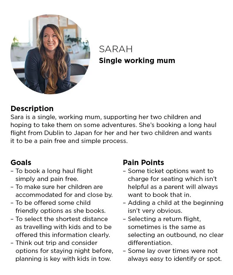
Based on the scenario created and the type of customer journey I wanted to explore, I created an example of the Persona behind the journey. It includes a brief description along with goals and pain points.
Affinity Diagram and Prioritisation Matrix
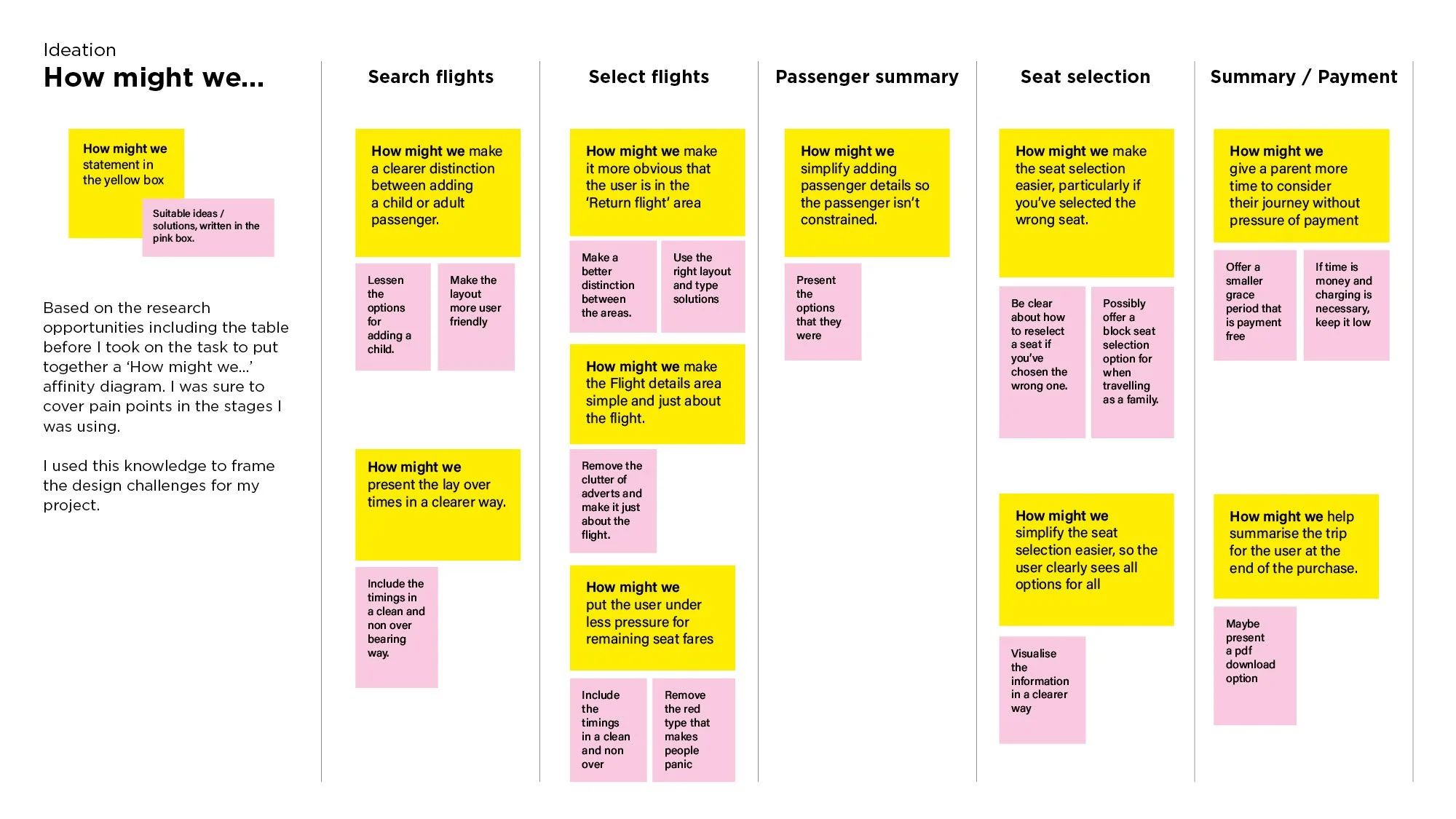
To frame the design challenges for my project, I produced a How Might We, Affinity diagram. I also plotted goals to be explored based on the following customer value and technicalities.
Ideation
User Flows
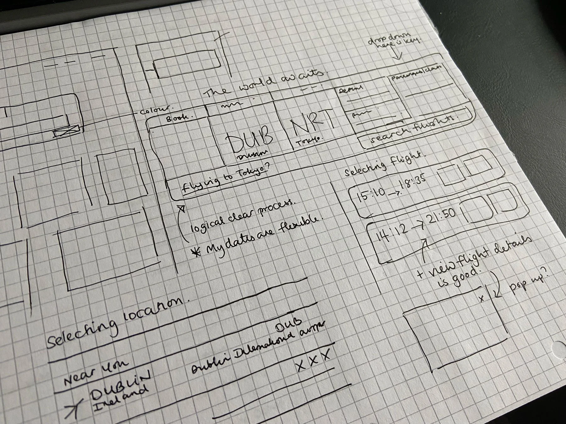
Low fi wireframes
Ideation then took part in the form of sketching. I had ideas forming from the research and I also referred to competitors to see who was, if any, providing any clear solutions to the pain points I was coming across.
Prototype and Test
Usability Testing
Example of a change made
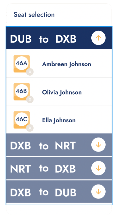
Seats
Added a small cross to the seat number itself, to allude to the fact that the seat can be cancelled. Originally I had the cross placed to the right of the name and it was pointed out to me that it looked like I was removing a passenger placing it there.
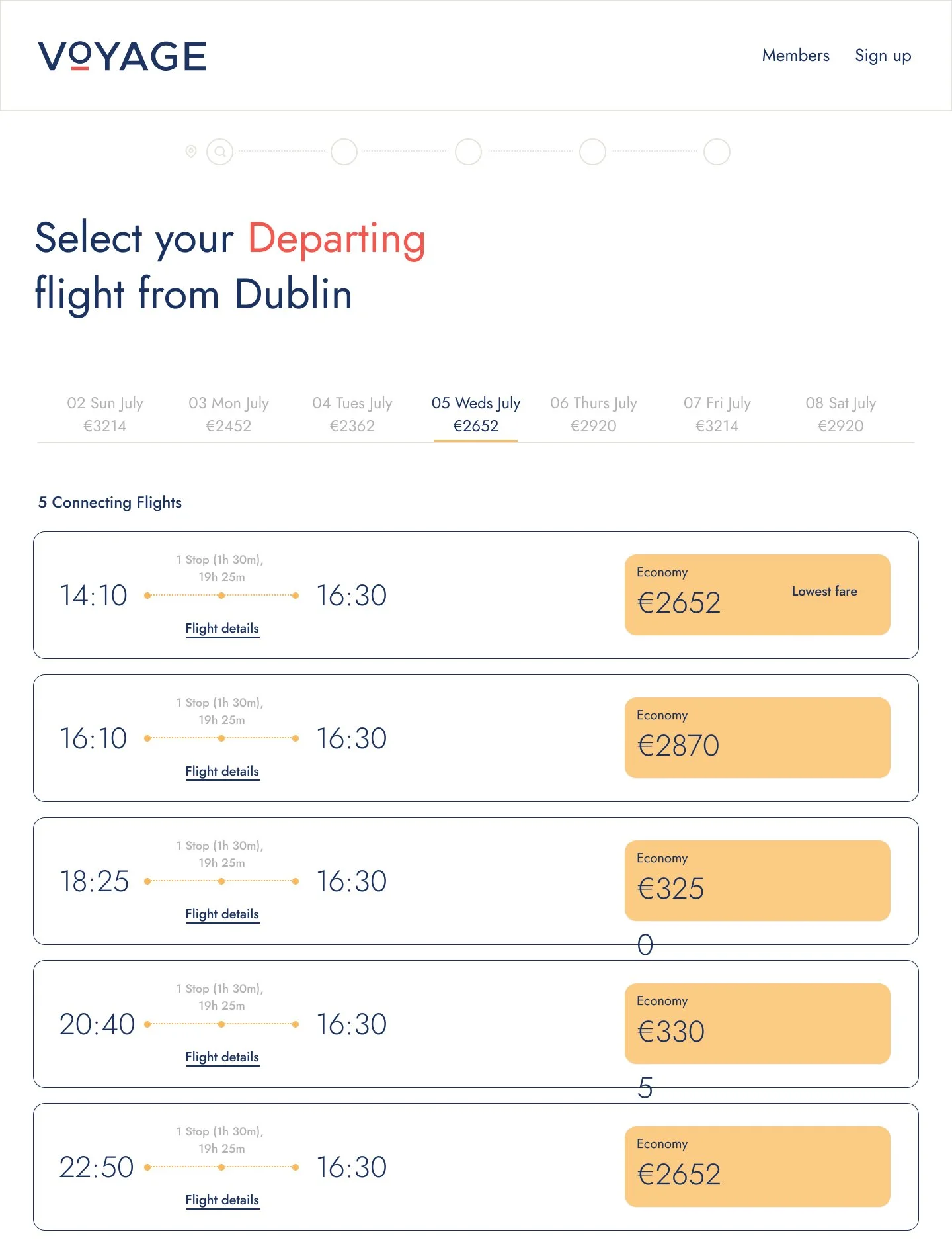
Some of the screens created for the Hi-fi Prototype
When it came to user testing, I tested with two of the previous users as well as a colleague on the course.
I produced a table to identify positive and negative feedback as well as what changes were then made as a consequence.
Goal
The goal was the same as before to book the same long haul flight for one adult and two children.
Methodology
I followed the same patterns as before, used a prepared script, outlined their tasks and eased them into using the prototype.
Outcomes
I felt this went successful enough, going back to the users/persona’s that I had contacted for the Customer journey map. It was important to get their reactions so I could figure out if I’d corrected their pain points accordingly.
To have one of them say that they felt the whole process was a lot smoother and simpler than last times was a great response. I didn’t have too many amends to make to finalise the design.
Conclusion
I feel that through this project, I used the right research techniques to develop my understanding of user goals and problems and that I was able to analyse and articulate them in a way that would help resolve a future customer experience.
I think I maybe could have done more sketching and figuring out of certain processes for the wireframing. Then again some elements were easier to figure out whilst developing and seeing them animate. I also underestimated how technically skillful you needed to know Figma to really convey what you were trying to achieve.
I felt that I did my best to respond to every goal and pain point that was identified through the process. To have some relatively easy experiences through the user testing at the end was a testament to this.
